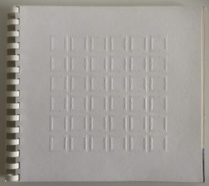
PictureBook: Passage of the Future / Window to the Past. Hand bound, cut-up. 25 copies.
Passage of the Future / Window to the Past
The IT-University of Copenhagen, 31. August 2004
Klaus Bjerager, concept.Leo Scherfig og Klaus Bjerager project design
External lecturer, Deparment of Design, Communication & Media
The IT-University of Copenhagen
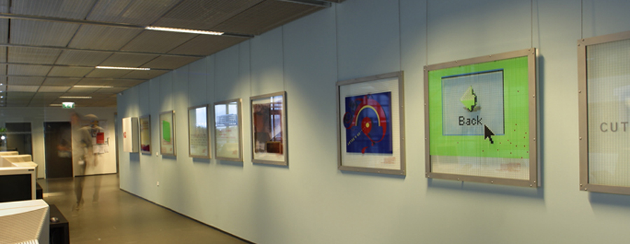
The storytelling project, Passage of the Future / Window to the Past consist of 36 steel framed pictures; silkscreen on float glass with steel wiregrid.
It is conceived as a visual commentary on the processes of the design of the building by architect Henning Larsen and the actual building of the IT-University of Copenhagen from its inception June 2000 to June 2003.
The Virtual Baby Grands
The team behind the arts project, The Virtual Baby Grands*, created a timeline highlighting essential aspects of how the building came to existing.
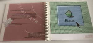
Page right: Picture no. 7, January 2001 – Commited [ to the Project ]
The Virtual Baby Grands created a timeline – highlighting key aspects and themes of how the building came into existing
Passage of the Future
When something as unique as the founding of a new university is in progress, everyone involved is tied up with specific tasks and nobody has the time to record what is going on.
However, such a story will become important in the years that follow as the institution consolidates and matures and people may start to inquire about its early history; about the whys, the hows and the why-nots?
Page right: Picture no. 29, October 2002 – It’s Just a Stop Away
Official records from government files and minutes from meetings will always be there to tell part of the story, but to catch the moments of the completion of a building under construction is something else.
That is the story we, The Virtual Baby Grands decided to tell, with ymbolic initial financial help from management at the IT-University and and engaged sponsorships **.
Window to the past
The idea for this storytelling project followed the selection of the winner 21 June 2000 of the architectural competition to design the new IT-University: HLT A/S (Henning Larsens Tegnestue A/S.
Unique was also the geographical location: the new university was to be located in Ørestad,– a nascent district at the time – located on Amager on the outskirts of Copenhagen that recently had been linked to Sweden by a spectacular hanging bridge, Øresundsbroen.
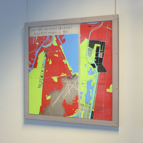
Picture No. 19, January 2002 – On the Map
The Playbook
To record the ‘passing’ of time a playbook was developed.
A five item dogma projectplaybook to adhere to
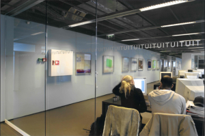
- based on the actual monthly building process data and documents the project should offer a visual voice to the ‘genesis’ of the IT-University through the planned 36 month building period
- based on the end-users perspective the visual voice should document the most promoninent theme of each month
- based on a collaboration with HLT the storytelling project should be an integral part of the architecture of the new building, to be exhibited permanently in the new IT-University building
- the purpose of the storytelling project was to be testament to the integration of ‘the arts, science and business’ perspective that is core to the unique curriculum at the IT-University
- the individual pictures should during the building construction period be hung sequentially and temporarily in the leased building hosting the IT-University.
Architect Henning Larsen’s endorsement
Architect of the new IT-University, AIA price winner Henning Larsen, well known for his willingness to dare to walk where noone has walked before gave his support for the project immediately.
“It is the rare situation when the creative processes from the drafing phases to the completion of the construction is documentet – most often, all that is known is the final set of drawings and the completed building.
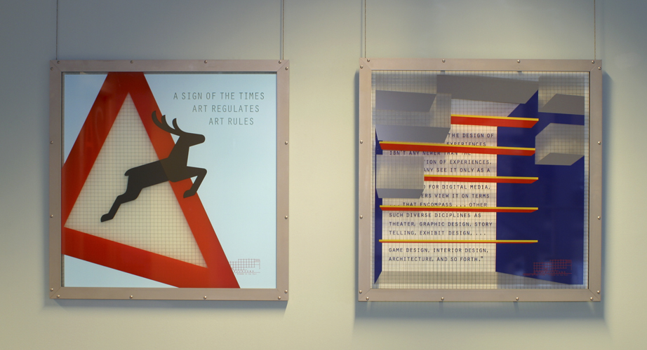
Picture No. 34, April 2003 & No. 35, Maj 2003 – The Art of Wayfinding & Experience Design [Ucanfeelit ]
Everyhing else that takes place between these two points, is usually lost for good
Therefore I am most pleased to see that the arts project ‘Passage of the Future / Window to the Past will preserve elements from this process and give them an independent artistic expression, for the times to come.”
Architect Henning Larsen, Copenhagen, 2. November 2000.
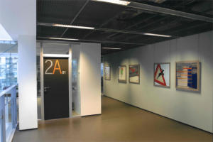
A 22 square meter collaborative effort
Since nothing reminiscent to final drawings of the building had been made when the storytelling project was initiated, no one had the faintest idea about where to hang the approximately 22 square meters (198 square feet) of panels that was proposed.
Therefore an arrangement was made with HTL that the architects should be consulted regarding where to hang the work and thus the project gained status as yet another building element to be taken into account.
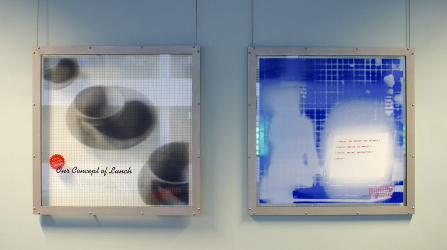
Picture No. 29, November 2002 & No. 30, December 2002 – Lunch on the Line & Not Exactly a Love-bite
The choices of materials were determined by the requirements of permanency in a public space
Hypothetically the storytelling project could serve as a dividing wall in the cafeteria, a ceiling in an auditorium or a free standing installation in the atrium.
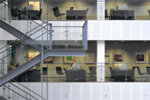
In order to meet fire code specifications and other regulations, fireproof steel-wired glass was selected as ‘canvas’, framing of steel, designed in such a way that it could be a self-bearing structure.
The choice of glass as the ‘canvas’ seemed natural in the context of a HTL building because transparency and support of the flow of natural light is a common theme in most HLT buildings.
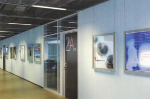
In the end the hanging of the panels from the ceiling along the walls on the second floor was dedided on, as it made the panels visible from most floors and all directions.
A disciplined visual voice
The creation of 36 panels over a matching 36 months period of time calls for foolproof guidelines to uphold the integrity of the project.
7 guidelines were formulated that over time should prove to be both operational and all that was needed
- each picture should have three narrative levels. a) qualifying as a work of art in its own right. b) referring directly to one ore more specific building process data documents. c) narrating content only with relevance to building processes in general on a universal level
- quotations of relevance chosen from the book ‘Invisible Cities’ by Italo Calvino should be used to comment on selected themes
- individual panels – should as often as possible – be breated unto themselves, without regard for already completed works
- all panels should follow the same format
- use of materials and production techniques should be limited to float glass, steel, gold leaf, silkscreen inks, sample material refering to the building, one or two sided silk screening and sandblasting
- each panel should carry identical signatures, a calendarium, identifying the month, year and number of the respective panel
- typography and use of type should be consistent.
That was the playbook, but the creation of the panels also called for manual labor!
The Team
An editorial board: The Virtual Baby Grands
From the very start the intention was to have a editorial team work along lines similar to any editorial board of a monthyl publication.
The Grand practitioners
The concept had barely been formulated before the IT-University hired a chief architectural consultant, architect Eva Grell Frederiksen to supervise the building project. Eva was a natural choice as our main source on building process data.
A sponsor agent, engineer and sculptural artist Lars Peter Christensen had already been contacted due to his competences with product development.
To juxtapose my own functionalistic/classisist design background Leo Scherfig, a bold and radical graphic designer was invited on board.
Grand practitioners: Eva Grell Frederiksen, Lisbeth Klastrup, Leo Scherfig, Lars Peter Christensen, Klaus Bjerager.
The Grand theoreticians and free-lancers
To balance out the pragmatic minds an alliance was forged with – at the time – ph.d. students Ida Engholm, Ida Klastrup, Jesper Juul and IT-University students Ida Wang Carlsen, Sune Børsen, Carl Kjær og Torben Kjærgaard. With this team a potent editorial board coud be established.
We decided to name ourselves:
The Virtual Baby Grands – an ever changing improvising band of fine-tuned visually oriented minds
- virtual because the members used no tangible instruments, only intellect and grit
- ever changing because the storytelling project would be created based on a principle of continually changing interpersonal editorial constellations
- improvising because each month a new editor would head the team
- fine-tuned visually oriented minds because the signifier that qualified for participation would be an ability to verbalize visual ideas / visualize verbal ideas
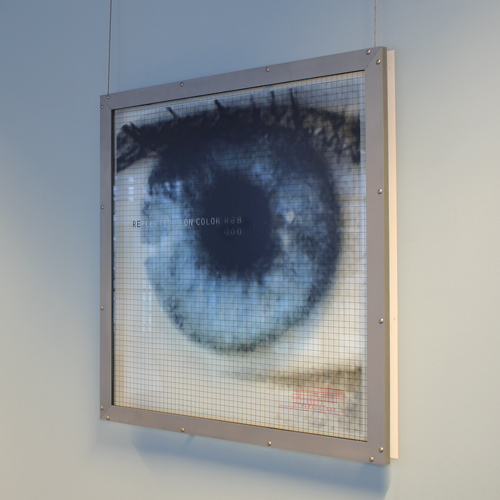
Picture No. 20, February 2002 – Colour Schemes.
The process
Visual editing
During the three years plus a regular editorial meeting was held once a month.
Any member was responsible for obtaining information about the ongoing building process.
At meetings each member presented one or more themes for discussion and the disignated editor of the month would direct the meeting towards concensus for the theme of highest priority.
When the theme had been decided on the editor would work along with the art director for the month and the graphic designer to create the visual representation of the theme.
The end result
Due to a building extension process beyond the our influence the storytelling project was completed a little more than for years after its inception.
Unexpected benefit
The storytelling project proved to serve a purpose beyond our imagination at the inception.
The partners of the building included architects, engineers, building consultants and administrators af many kinds.
The feedback was that the humour evident in several pictures had a mediating effect in an otherwise at times polarized environment.
It was evident that a platform had been created that allowed for a smile whenever we addressed various acute issues, a platform that invited to focus on partnering and collaboration.
Not a bad way to record a Passage of the Future and leave open a Windoe to the Past.
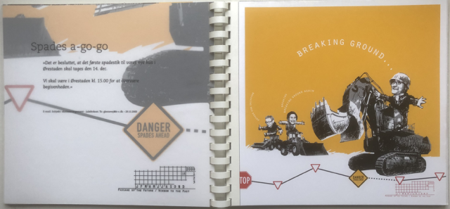
Page right: Picture no. 18, December 2001 – Spades a-go-go
Sponsors
This project was only made possible due to the generous participation of:
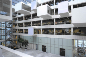
**) Christensen Grafisk Aps, Danmarks DesignSkole, DesignCo, Glarmester Snoer og Sønner A/S, Juhl A/S, Lunøe Serigrafi Aps, Mezzo Media, Nofoprint A/S, Nordisk Ståltryk Aps, Pilkington Danmark A(S, Floatglas, Ole Storm, Smede- & Modelværksted Aps, Steuerhaus Aps, Vester Kopi A/S.
All photos of the realized project: Stig Nørhald©2003. www.norhald.dk.
Other photos Designco©2019.
Published 31 August 2004, www.itu.dk/readit, the digital newsletter at the IT-University of Copenhagen.
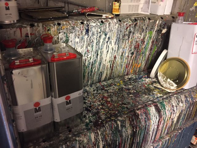
Silkscreen at The Danish DesignSchool, mixing of colours withDino Brown
All pagespreads & pictures
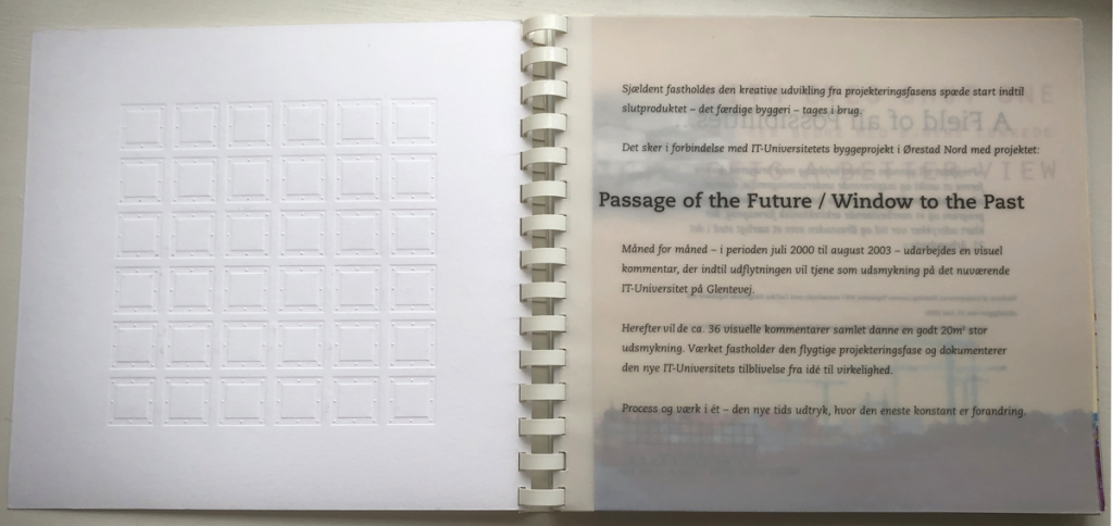
Passage of The Future / Window to The Past – Prolog to picture themes and pictures
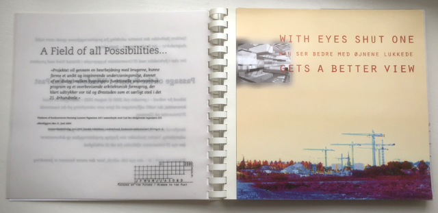
Picture No. 1, July 2000 – A Field of all Possibilities
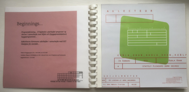
Picture No. 2, August 2000 – Beginnings …
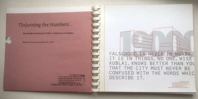
Picture No. 3, September 2000 – T [ ch ] urning the Numbers…
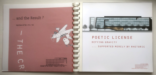
Picture No. 4, October 2000 – … and the Result ?
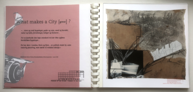
Picture No. 5, November 2000 – What makes a City [ great ] ?
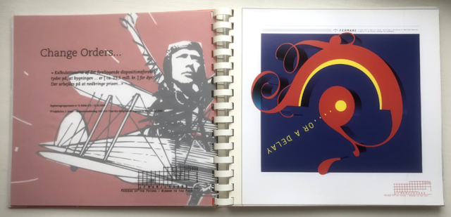
Picture No 6, December 2000 – Change Orders …

Picture no. 7, January 2001 – Commited [ to the Project ]

Picture No. 8, February 2001 – … and then there’s the Lease
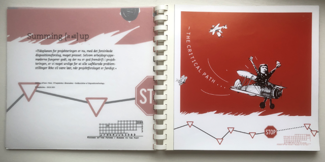
Picture No.9, Martch 2001 – Summng [ it all ] up
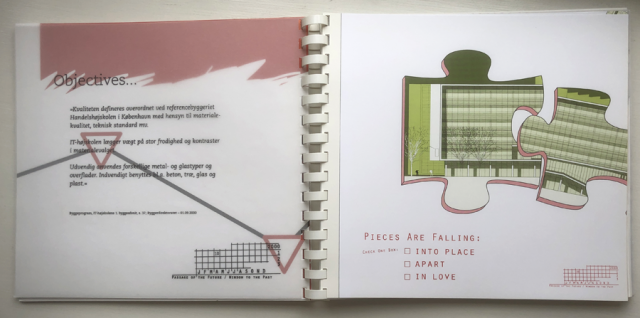
Picture No. 10, April 2001 – Objectives …
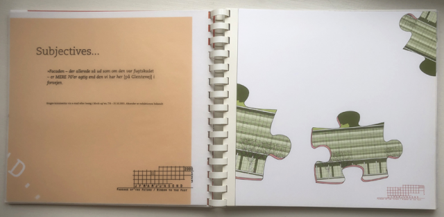
Picture No. 11, May 2001 – Subjectives…
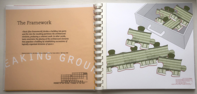
Pictures No. 12, June 2001 – The Framework
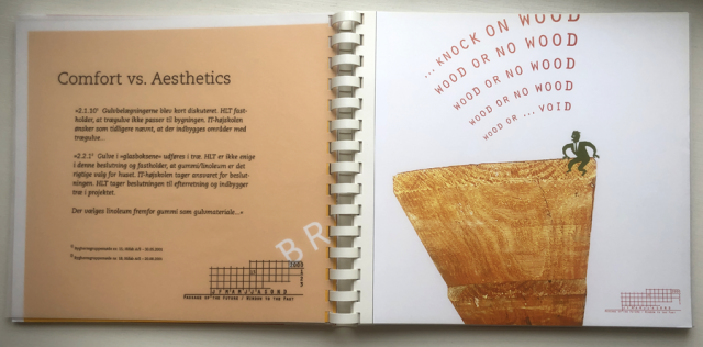
Picture No. 13, July 2001 – Comfort vs. Aesthetics

Picture No. 14, August 2001 – The little House on the Prairie
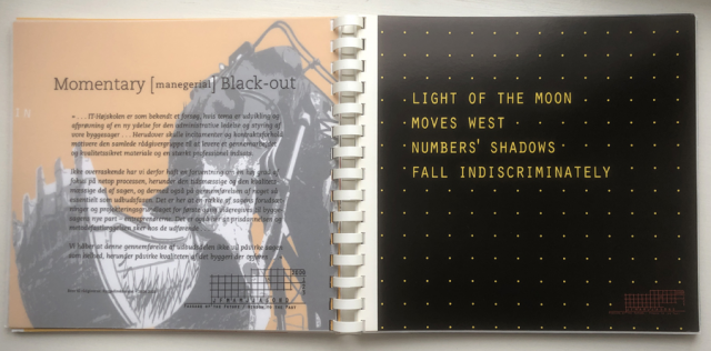
Picture No. 15, September 2001 – Momentary [ maneerial ] Black-out
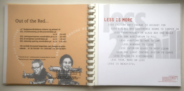
Piicture No. 16, October 2001 – Out of the Read…
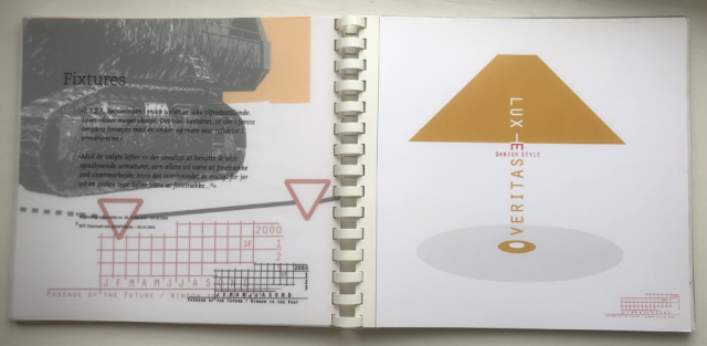
Picture No. 17, November 2001 – Fixtures

Picture No. 18, December 2001 – Spades a-go-go
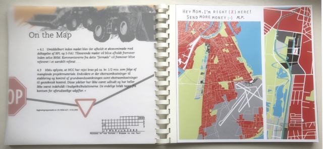
Picture No. 19, January 2002 – On the Map
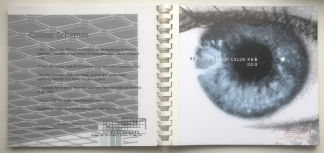
Picture No. 20, February 2002 – Colour Schemes
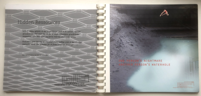
Picture No. 21, May 2002 – Hidden Ressources
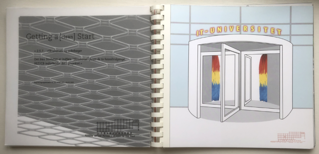
Picture No 22, April 2002 – Getting a [ clean ] Start
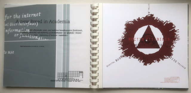
Picture No. 23, May 2002 – A new Breed in Academia
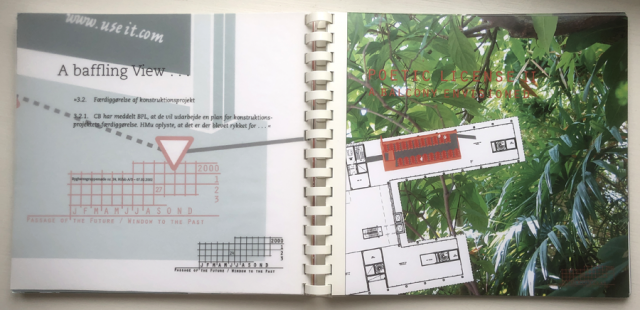
Picture No. 24, June 2002 – A baffling View
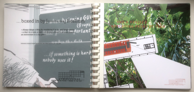
Picture No. 25, July 2002 – … boxed in by [ constructive ] Realities
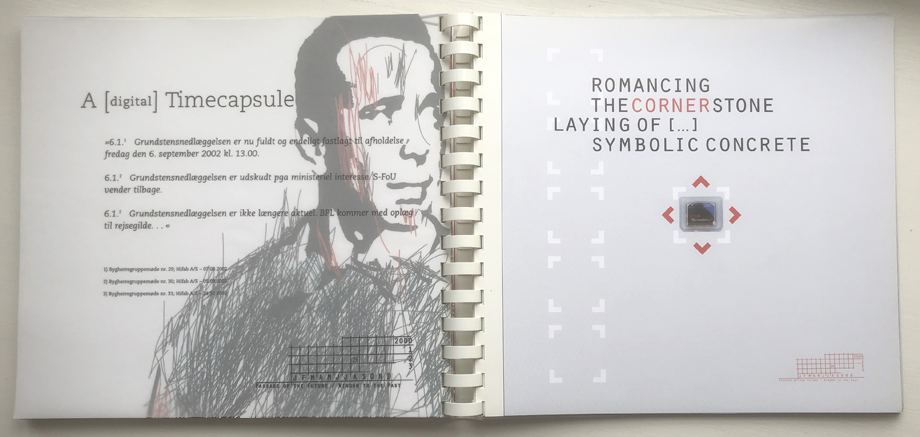
Picture No. 26, August 2002 – A [ digital ] Timecapsule

Picture No. 27, September 2002 – Beware: lov Ceiling!
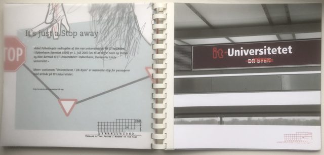
Picture No. 28, October 2002 – It’s just a Stop away
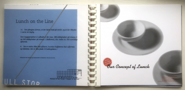
Picture No. 29, November 2002 – Lunch on the Line
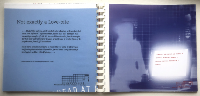
Picture No. 30, December 2002 – Not exactly a Love-bite
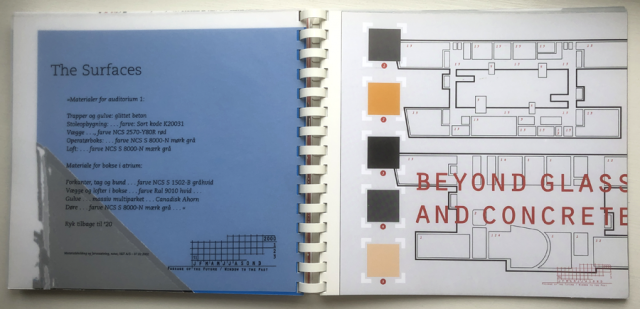
Picture No. 30, January 2003 – The Surfaces
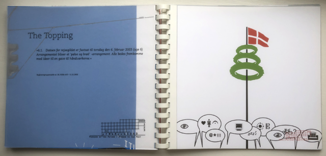
Picture No. 32, February 2003 – The Topping
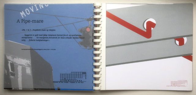
Picture No. 33, March 2003 – A Pipe-mare
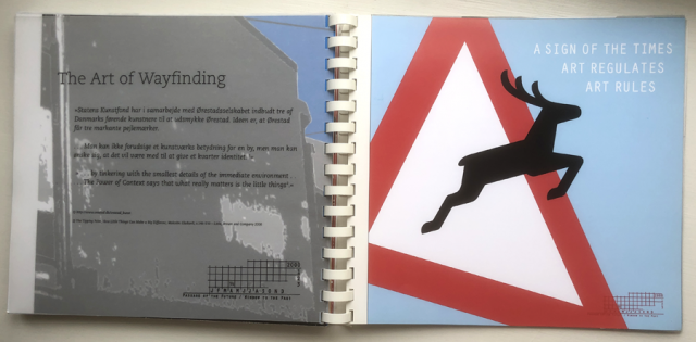
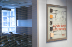
Picture No. 34, April 2003 – The Art of Wayfinding
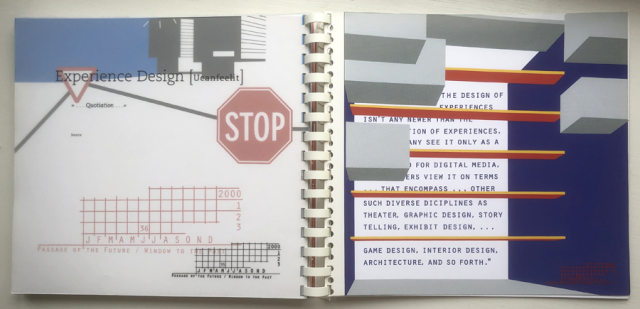
Picture No. 35, May 2003 – Experience Design [ Ucanfeelit ]
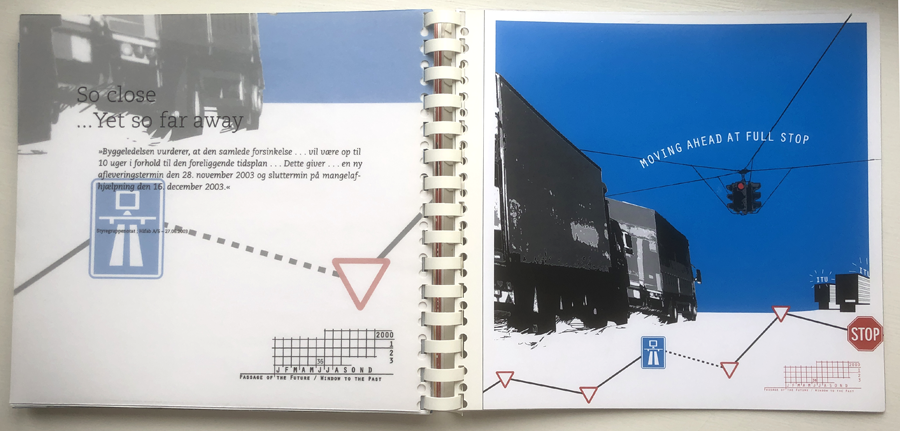
Picture No. 36, June 2003 – So close … Yet so far away
All rights reserved Designco©2019
Seneste kommentarer